
This is a guest post from one of ProZ.com's advertising partners, Middlebury Institute of International Studies
By: Kyle Chow
What’s obvious to translators isn’t always so obvious to clients. I’ve found this to be especially true when encountering the impact of major design differences between the same online content in different languages. Helping our clients figure out how to navigate the design differences between cultures is one of the most valuable services we as translators can offer.
Website Design: Foundational Differences between Japan and the U.S.
During a recent Btrax virtual event on how design approach differs between U.S. and Japanese clients, I took note of how different the foundational design of U.S. and Japanese websites and marketing materials can be.
For example, the Japanese and U.S. versions of the Yahoo homepage bear no resemblance to each other. Even the brand logos are completely different. While this is because the two sites are essentially run by different companies, these visual differences also give us a lot of information about design in the U.S. vs. Japan.
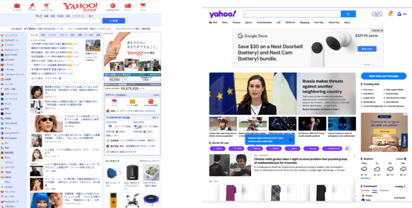
In the Btrax video, one of the hosts, Jonathan Chen, explains that Japanese users “have to understand the whole entire page, and they take that information and make a decision on it”—so too many graphics can get in the way of the text. The audience for the site’s U.S. counterpart, however, is more likely to put together different pieces of information from around the page to allow the user to make quick decisions. Chen also mentioned an article he wrote on the differences between Japanese and American user experiences, which is an excellent read.
The Btrax video then compares Sony’s Japan and U.S. sites: the Sony Japan site has much more emphasis on stylized text, whereas the U.S. version pays far more attention to the visuals surrounding the products.
When to Begin Localization? At the Beginning!
To develop content for different regions, and to create a fully adapted user experience in both regions, when should the localization team be consulted? Ideally, at the onset of a project.
Imagine if Japanese marketing materials are developed for a campaign, and only after the Japanese materials are finalized are they then handed off to the localization team for localization into English.
Even with the best translators, amazing replacement fonts, and stylizing the English text to make it as polished as the Japanese version, in the end, a company still might find their U.S. target audience isn’t clicking on ads. To truly adapt these materials to the U.S. market, a different design would need to have been created at the beginning.
To illustrate this, an example I recently heard from a colleague was that a U.S. automaker wanted to sell their vehicles in Japan. They localized all the related content—the brochures, the user manual, the TV ad, even the UI on the dashboard—but when they finally started selling the car, Japanese customers were shocked to find the steering wheel on the left, not on the right as is customary in Japan. If only they had asked the translators for feedback on the car design!
This is why localization should not just be a process that happens after the original content has been finished. Localizing content means not just thinking about the translation of the text, but also adapting the underlying design in a way that makes the content feel like it was made for a target audience, which a lot of the time can only happen if localization is incorporated throughout the entire development process.
Must-See TV?
After seeing the stark differences between the U.S./Japan Yahoo websites, I looked at other sites to see if I could spot the same design trends. As many of my personal localization projects will tell you, I am a huge fan of Japanese TV, so out of curiosity, I compared the sites of one of the top Japanese TV networks (Nippon TV) and one of the top U.S. TV networks (CBS).
Here’s what their homepages look like:
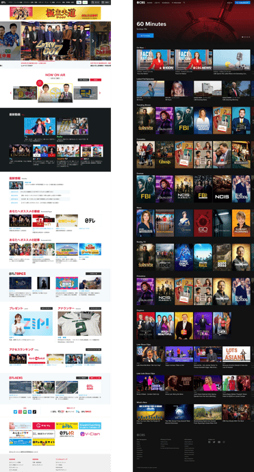
The Nippon TV site is more text heavy, but perhaps to a lesser degree than the Yahoo site. It’s worth noting that even beyond there being more text in show descriptions, the tiles for the shows themselves tend to have the text as more of the “main feature” (a couple are actually only text), whereas the vast majority of the show tiles for the CBS site have the text at the bottom, with the non-text graphics capturing more of the reader’s attention.
Opportunity Abounds
As a translator, you have the opportunity to capitalize on the need for localization throughout the duration of a project. Companies like Pinterest and Meta are creating new roles for their linguists called localization editors, and these team members are sitting at the table when new products are just ideas. A lot of times, true localization can only happen if it is incorporated throughout the entire development process—thus, many translators have the potential to add value early on with their ability to see the ways in which the underlying design can be adapted to make the content feel like it is truly made for a target audience.
Kyle Chow is a second-year student in the Translation and Localization Management program at the Middlebury Institute of International Studies at Monterey.
.png?width=100&height=100&name=MIIS%20logo%20large%20(1).png)
